
How to implement a seamless responsive video background using Youtube and WordPress
Today, I wanted to share my technique on how I build video backgrounds on WordPress using Youtube. I think it’s a pretty neat strategy I’ve used for a while now that just works, and it’s always been the most reliable solution that works across all browsers on desktop and mobile.
There are plugins out there that can spit out a full page video for you in WordPress. I’ve even used one before, but I think this method is far simpler to implement and provides you a lot more control over where and how the video is served.
Sidenote: although this article is written around implementing full screen videos in WordPress, this method is easily transportable to other projects.
Why Youtube/Vimeo?
If you want to serve a video background reponsively, it’s a good idea to host it on a dedicated host such as Youtube or Vimeo. Not only will you save bandwidth by not uploading videos to your own site, these video services are also designed to serve videos optimally based on a number of factors including internet speed and device size. They are also able to handle large video uploads and provides a video player that is far more robust than the default html5 video player.
I often use Youtube because it is easier and has a well documented api, but if you have the means to do so, I highly recommend using Vimeo. Their buffering and quality is amazing, and if you have a pro account you can also hide all branding which makes your life as a developer much easier. In fact, Vimeo provides responsive options in their embed code, which means you may not even need the following tutorial but simply their embed code.
The pitfalls of embedding videos
Embedding a Youtube video on a website is essentially embedding an iframe that loads a video.
When you resize the browser, regardless of any iframe styles, you’ll notice the video will not resize with the window.
Instead you’ll get black bars, like below:
This is due to the fact that videos are restricted by its aspect ratio. That is, the proportion between its width and its height. Most videos filmed these days are 16:9, or 16:10.
This issue, coupled with the workarounds you need to include for the browser to autoplay videos is why implementing video backgrounds is a lot more finicky than it sounds.
If you are ok with serving a video at 16:9 resolution on all browser devices, you can simply use the padding bottom trick to do so. You can also try using this method here, which is very effective, but does not cover the browser resizing aspect of it, or account for Youtube’s branding.
The method below takes care of these pitfalls and allows the video to act similarly to background:cover. The video will be cropped at some points particularly on mobile devices, but it will also adjust to any browser size on resize without showing the ugly black bars or Youtube’s branding. One of the biggest advantages of using the below technique though is the fact that it also allows videos to be autoplayed on mobile devices.
The method
Create a custom field to store the Youtube video ID.
Optionally also create an image field to store a custom thumbnail image. We’ll use this to hide the buffering icon later.
I use and love ACF, but you can create this custom field however you wish, as long as it is easily updateable.
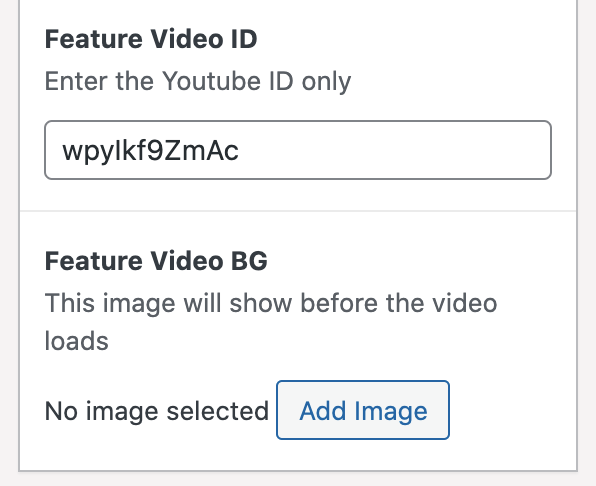
Update the custom fields with your Youtube Video ID and custom poster thumbnail.
For example, if the Youtube link was https://www.youtube.com/watch?v=8j68_4z7Sbg you would update the custom field with 8j68_4z7Sbg.
Paste the following code into your markup and edit the variables as necessary to suit your own site.
The next step involves a bit of PHP and implementation of the Youtube JS API. Using the JS api is necessary to trigger the video to autoplay.
You’ll probably need to paste the following in your code editor and read the comments for further details on how to edit this snippet.
<?php
$video_id = get_field('feature_video_id');
$video_poster = get_field('feature_video_bg');
?>

<div class="feature video">
  <div class="video-bg">
    <?php
    //get your custom poster thumbnail
    if ( $video_poster ) :
    // $img_id = is_product_category() ? $thumbnail_id : get_post_thumbnail_id($ID);
    $img_id = $video_poster;
    $size = 'large';
    $img_src = wp_get_attachment_image_url( $img_id, $size );
    $img_srcset = wp_get_attachment_image_srcset( $img_id, $size );
    $title = get_post($id)->post_title;
    $alt = isset(get_post_meta($id, '_wp_attachment_image_alt')[0]) ? get_post_meta($id, '_wp_attachment_image_alt')[0] : $title;
    ?>
    <img src="<?php echo esc_url( $img_src ); ?>"
    srcset="<?php echo esc_attr( $img_srcset ); ?>"
    sizes="
    (max-width: 768px) 800px,
    (max-width: 1200px) 1400px,
    (max-width: 1600px) 1600px,
    100vw"
    alt="<?php echo $alt; ?>"
    class="img"
    loading="lazy">
    <?php endif;?>
    /*
    note: if you prefer to use Youtube's auto-generated video thumbnails instead of specifying a custom video poster, you could simply use something like this:
    <div id="video" class="animate video-wrapper" style="background-image:url('http://img.youtube.com/vi/<?php echo $videoid; ?>/maxresdefault.jpg')">
    */

    <div id="video" class="animate video-wrapper">
      <div id="player"></div>
        <script type="text/javascript">
          var viewportWidth = window.innerWidth || document.documentElement.clientWidth;
            /* if the browser width is more than iPad Pro size, render the iframe
            I keep the following conditional in here because I don't often use autoplaying
            vides on mobile devices. You can uncomment th conditional below if you prefer the video to autoplay on mobile
            */
            // if ( viewportWidth > 1024) {
              // 2. This code loads the IFrame Player API code asynchronously.
            var tag = document.createElement('script');
            tag.src = "https://www.youtube.com/iframe_api";
            var firstScriptTag = document.getElementsByTagName('script')[0];
            firstScriptTag.parentNode.insertBefore(tag, firstScriptTag);
            var player;
            var playerWrapper = document.querySelector('#video');
            function onYouTubeIframeAPIReady() {
              player = new YT.Player('player', {
                videoId: '<?php echo $videoid; ?>',  // youtube video id
                allowfullscreen: 1,
                playerVars: {
                  'enablejsapi': 1,
                  'autoplay': 1,
                  'rel': 0,
                  'iv_load_policy': 3,
                  'showinfo': 0,
                  'modestbranding': 1,
                  'playsinline': 1,
                  'showinfo': 0,
                  'rel': 0,
                  'controls': 0,
                  'color':'white',
                  'loop': 0,
                  'mute':1,
                  'playlist': '<?php echo $videoid; ?>',
                  'wmode': 'opaque'
                },
                events: {
                  'onReady': onPlayerReady,
                  'onStateChange': onPlayerStateChange
                }
              });
            }

            function onPlayerReady() {
              player.playVideo();
              player.mute();
            }
            function onPlayerStateChange(el) {
              if(el.data === 1) {
                playerWrapper.classList.add('fadein')
              } else if(el.data === 0) {
                // playerWrapper.classList.remove('fadein')
                player.playVideo();
                player.mute();
              }
            }
        // }
        </script>
    </div>
  </div>
</div>
The most important thing to note in this step is that you must ensure the video loads with muted audio, not just because it is bad practice to autoplay audio on a website but because it is something most browsers discourage and may affect your site’s ranking.
If you’ve updated your code and your video is not autoplaying at this point, there is likely an error with the JavaScript in which case you should go over your code carefully to check for typos, and consult the API page. Also note that videos will automatically not play in Safari in low power mode on iPhones. Users are also able to block all videos from autoplaying in their phone settings on Safari, and there is nothing you can do to get around this as far as I know.
Add the SCSS
Add the following styles to your site in whichever way your prefer. Note that the following code is in SCSS syntax.
//this is the outer container wrapper and it contains the video. It can be any height you wish but since I am making a background today, I'm leaving it as 100vh.
.feature.video {
  height: 100vh;
  width: 100%;
  overflow: hidden;
}
.video-bg {
    height: 100%;
    background-color: #000;
    .img {
      height: 100%;
      position: absolute;
      top: 0;
      left: 0;
      width: 100%;
    }
}
.video-wrapper {
  position: absolute;
  top: 50%;
  left: 50%;
  transform: translate(-50%, -50%);
  display: block;
  height: 0;
  width: 100%;
  padding: 0;
  padding-bottom: 56.25%;

  iframe {
    height: calc(100% + 250px);
    width: 100%;
    position: absolute;
    top: 0;
    left: 0;
    bottom: 0;
    pointer-events: none;
    margin-top: -200px;
  }
}
.video-wrapper ensures the iframe is always displayed at 16:9 ratio using the padding-bottom trick, while feature.video wraps around it all to set the height and clip any overflow (which will be scaled using JavaScript in the next step).
I also gave the iframe extra height and a negative margin to hide Youtube’s branding. You can’t get rid of the logo etc entirely, so with a bit of smoke and mirrors we hide it with CSS magic.
Also it is important to note, this code defaults to a 16:9 resolution. If the resolution of your video is not this size, you’ll need to update the padding percentage of .video-wrapper according to the proper aspect ratio. You can click here for more examples of different aspect ratio padding percentages.
By this point the video should be autoplaying smoothly on all browsers and devices, but the aspect ratio still isn’t right. There’s just one more thing we need to do…
Scale the video on browser resize
This extra snippet is what brings it all together, and is really what makes the video act like ‘background-cover’.
Using the browser’s width and height and some handy CSS transforms, we can calculate how much the video should be scaled by its proportion to it’s outer wrapper.
Attaching this to a resize event ensures the video’s scale updates as the browser’s size updates.
If you are using the default version of jQuery that is shipped with WordPress(1.12.4), you can simply use the following code:
function video() {
    let video = $('.video-wrapper'),
        wrapperWidth = $(window).width(),
        videoWidth = video.outerWidth(),
        videoHeight = video.outerHeight();

    //this is to get around the elastic url bar on mobiles like ios...
    if ( $(window).width() < 1024 ) {
      let wrapperHeight = $(window).height() + 200;
    } else {
      let wrapperHeight = $(window).height();
    }

    let scale = Math.max(
        wrapperWidth/videoWidth,
        wrapperHeight/videoHeight
    );
    video.css({
      transform: "translate(-50%, -50%) " + "scale(" + scale + ")"
    });
}
video();
$(window).on('resize', function() {
    video();
});
If you are using the latest version of jQuery, or simply vanilla JS, I recommend using this snippet which is in vanilla JS:
function video() {
    var video = document.querySelector('.video-wrapper');

    if (video !== null) {
      var wrapperWidth = window.outerWidth,
          videoWidth = video.offsetWidth,
          videoHeight = video.offsetHeight;

      //this is to get around the elastic url bar on mobiles like ios...
      if (wrapperWidth < 1024) {
        var wrapperHeight = window.innerHeight + 200;
      } else {
        var wrapperHeight = window.innerHeight;
      }

      var scale = Math.max(wrapperWidth / videoWidth, wrapperHeight / videoHeight);
      document.querySelector('.video-wrapper').style.transform = "translate(-50%, -50%) " + "scale(" + scale + ")";
    }
  }

  video();

  window.onresize = function (event) {
    video();
  };
The reason these two snippets are slightly different is because older versions of jQuery relied on a far clunkier(and possibly wrong) way of calculating the inner width/heights of elements. Newer versions of jQuery use getBoundingClientRect() which is much more reliable. If at all possible, I would recommend just using the vanilla js snippet, however both should work in either scenarios.
If everything worked out well, you should now have a fully functioning autoplaying video background contained within your element.
If you’d like to see this technique in action, here are three sites I’ve built using this technique.