
Design vs. Usability
Web development has come so far in recent years that it blows my mind thinking back to the time when using Bootstrap was as normal as using React for a project. Much of the tooling and processes have changed significantly, but the fundamentals of good design and web standards have not.
I wanted to briefly blog about the topic of design for design’s sake today, because it’s been on my mind for a while now and it irritates me to no end when I come across a celebrated website that mistakes ornamentation for innovation. Worse still, are the sites that jump on a trend just because it’s popular, with no consideration for usability or accessibility.
There is a phrase you may hear if you are in the design world, and that is “design without purpose is just decoration”. There’s nothing wrong with designing a site for art’s sake, but if your site is meant to be used by users, disregarding usability and accessibility for fancy animations seems counterintuitive.
Objectively speaking, good design can be separated from truly innovative design by how it makes people feel through it’s overall aesthetic and form. In the case of a website, I’d say usablity goes hand in hand with how it makes people feel.
Innovation doesn’t mean setting out to do something that hasn’t been done before. To me, a large part of innovation is making something familiar yet new at the same time. Innovation doesn’t mean you have to go out of your way to design every little thing to flex what you can do and what you know.
Design should speak for itself- it should be nuanced, thoughtful, and understated when it needs to be. The goal of a design should not be an all out assault on your senses (unless it calls for it of course).
Design for design’s sake
If you peruse the websites featured at places such as Awwwards or httpster, you’ll find a lot of beautifully animated and subjectively innovative websites. Many of them have a few things in common, the most important one being that many of them rely on experimental technologies that may come at the cost of accessibility and usability.
Sure, some of them may push and envelope, and actually, some of them are pretty great and well executed.
However, a lot of them are also over designed for designs’ sake, and here’s an example I came across the other day.
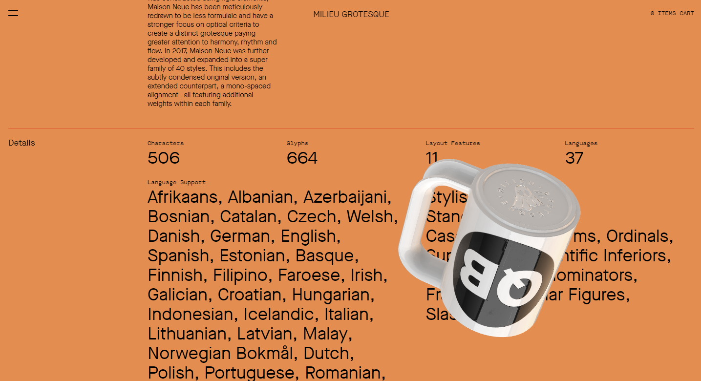
I was browsing some recommended sites and came across this neat-looking font foundry. From the outset, I liked their aesthetic and definitely wanted to see more of this particular font. The typsetting was lovely and this website had many interesting features that showcased each glyph really well on hover. The thing that ruined this design for me though was the rotating 3D objects that loaded throughout the page as I scrolled.
It was only after I’d scrolled to the bottom that I realised you could turn the objects off…with a toggle that was hidden in the top menu underneath some other junk.
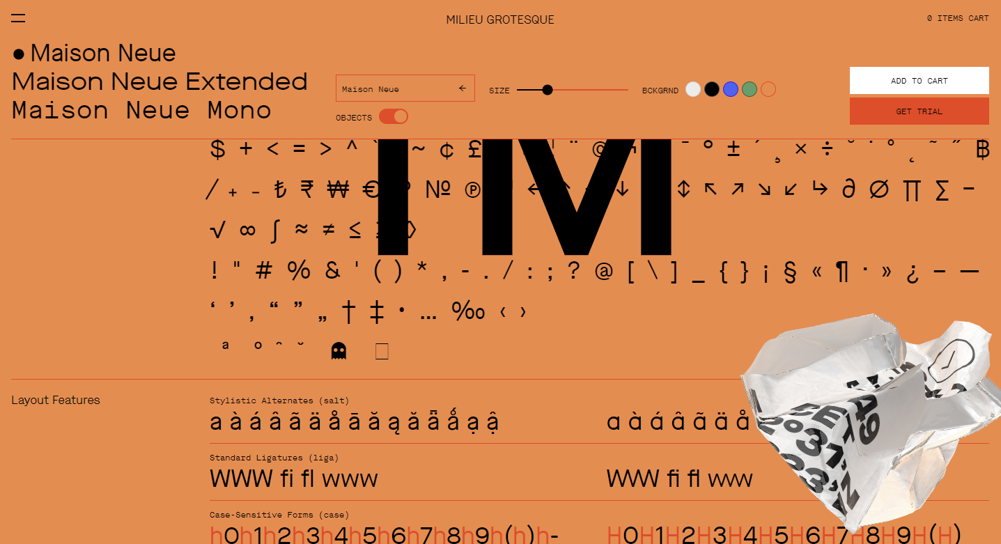
It makes me sad thinking about the hours spent implementing these useless objects because although they look cool they are absolutely unnecessary and an impediment to the site’s overall function which is to show off the font itself.
I know this issue is specific to this particular website, but it’s not all that uncommon to come across finicky UX issues like these especially on sites linked from “good design” aggregators.
It’s things like these that make me really cynical about what is considered the pinnacle of design in the industry today. Personally, I can’t fully appreciate these sites despite their cool features because of how inaccessible it is to everyday people.
I love a fun and interesting website, but even more so when I recognise the restraint it takes to reign in and edit a design when it needs it.
Over-engineering is a thing in the development world, and in the design world, it is actually possible to over-design.
Just because you can mock up something with a fancy animation, doesn’t make it thoughtful or well considered. Maybe the design meets the brief, and maybe some managers signed off on it, but a design shouldn’t be celebrated just for being different or for using as many cutting-edge technologies as possible.
A well considered design is self explanatory and inherently accessible to as many people as possible. I want these kinds of websites to be celebrated more.
To me, a website that meets this criteria is often quite simple in nature. Simple in the sense that you shouldn’t be hunting around the page for clues on how to navigate somewhere. But-
- Simplicity is not simply slapping content in a div and calling it a day.
- Simplicity is not just black and white.
- Simplicity can be as complex as a page from a medieval manuscript.
- Simplicity is incredibly hard to pull off successfully.
Front-end developers have an important role in controlling the final outcome of a website, and it’s for this reason that I want to highlight, more doesn’t necessarily mean better (despite what I may have said in the past…haha).
It may seem obvious but if you’re a part of the whole process of building a website, it really does help to make suggestions if you can think of a better way to do something. It might not always be the best or right solution for the task (we are only human after all), but you might find that even just suggesting a different perspective may help open up wonderful new avenues of thought that would otherwise have been unexplored.